

Question Nine Is Where They Quit
Application data keeps confirming the same uncomfortable pattern: candidates rarely abandon at the beginning. They abandon in the middle — at the ninth question of a form that has stopped respecting their time, on a phone, while a competitor’s one-page apply sits in the next tab. Completion is not a personality trait of your applicants. It is a design outcome, and this template treats it as one.
The Arithmetic of Drop-Off
Every additional field taxes every candidate. The traditional wall-of-fields layout makes it worse by showing the entire toll up front — a form that announces forty boxes is a form some people never start. A stepped flow hides the mountain and shows one step at a time; the same questions, sequenced differently, complete at meaningfully different rates.
Four Craft Fixes, In Order of Impact
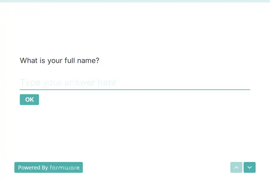
- One question per screen. A single visible item with clean forward movement — how navigation arrows pace a form — keeps momentum through the dull middle sections.
- Visible progress. A progress bar converts ‘how much more?’ from an anxiety into a fact. Completion rises when the end is always in sight.
- Ruthless requireds. Only identity and eligibility are mandatory; everything else invites. Every question you demote to optional is a completion you buy back.
- Test it on a phone. However it looks on your monitor, most candidates meet it on a five-inch screen. Run a preview on your own phone before launch — thumb-reach and keyboard behavior are design constraints, not afterthoughts.
Rescue the Half-Finished
Candidates get pulled out mid-form constantly — a manager walks by, a train arrives, a child wakes up. Under the old model, that progress evaporated and the pipeline quietly leaked. Partial submissions keep whatever was typed, contact details included, so a short follow-up can finish what the interruption started. (It is a plan-level feature; the pricing page spells out where.)
Close the Loop
Every finisher gets an instant confirmation through a respondent email, and every submission lands in the responses view — where completion rates, before and after any fix, are the metric that tells you whether the redesign worked.
Frequently Asked Questions
How many questions is too many?
Past roughly ten, completion decays sharply. Anything you cannot justify to a candidate in one sentence belongs in the interview instead.
Do candidates really apply from phones?
For most roles now, the majority do — and hourly applicants almost universally. Design for the thumb and the desktop takes care of itself.
What should we do with abandoned submissions?
Treat them as warm leads: contact details survived, so a short, human follow-up converts a decent share of them into finished applications.
How do we know whether our changes helped?
Compare started-versus-completed before and after each fix. The responses view keeps the denominator honest.